
Jayden
Howie.
Jack of all trades
No, I’m just Jayden
-
Defining what brands stand for and how they communicate, working from the inside out to build clarity, consistency, and connection.
What does the client truly need, desire, or rightfully deserve? In what ways can we effectively deliver that to exceed their expectations?
That’s what I love about Brand Strategy.
-
I craft logos that are both distinctive and functional; built to last, scale, and speak clearly across all touchpoints. Every mark is grounded in strategic thinking and designed to reflect the core of the brand it represents.
It’s not merely decoration; it is thoughtfully designed and truly fit for its intended purpose.
-
Designing digital experiences that prioritise clarity, usability, and brand consistency. From wireframes to high-fidelity UI & UX prototypes, I create interfaces that are intuitive to use and responsive across devices, always with the user front of mind.
-
Motion adds depth and energy to brand storytelling, from animated logos to dynamic mockups. Motion work helps bring static design to life across digital, social, and presentation formats.
-
I’ve created three branded product experiences for clients, each involving a range of elements such as packaging, punchboards, and cards. While this type of work was new to me at the time, I quickly found a passion for experience-led design and the detail it demands.
Blood, sweat and wrist-pain
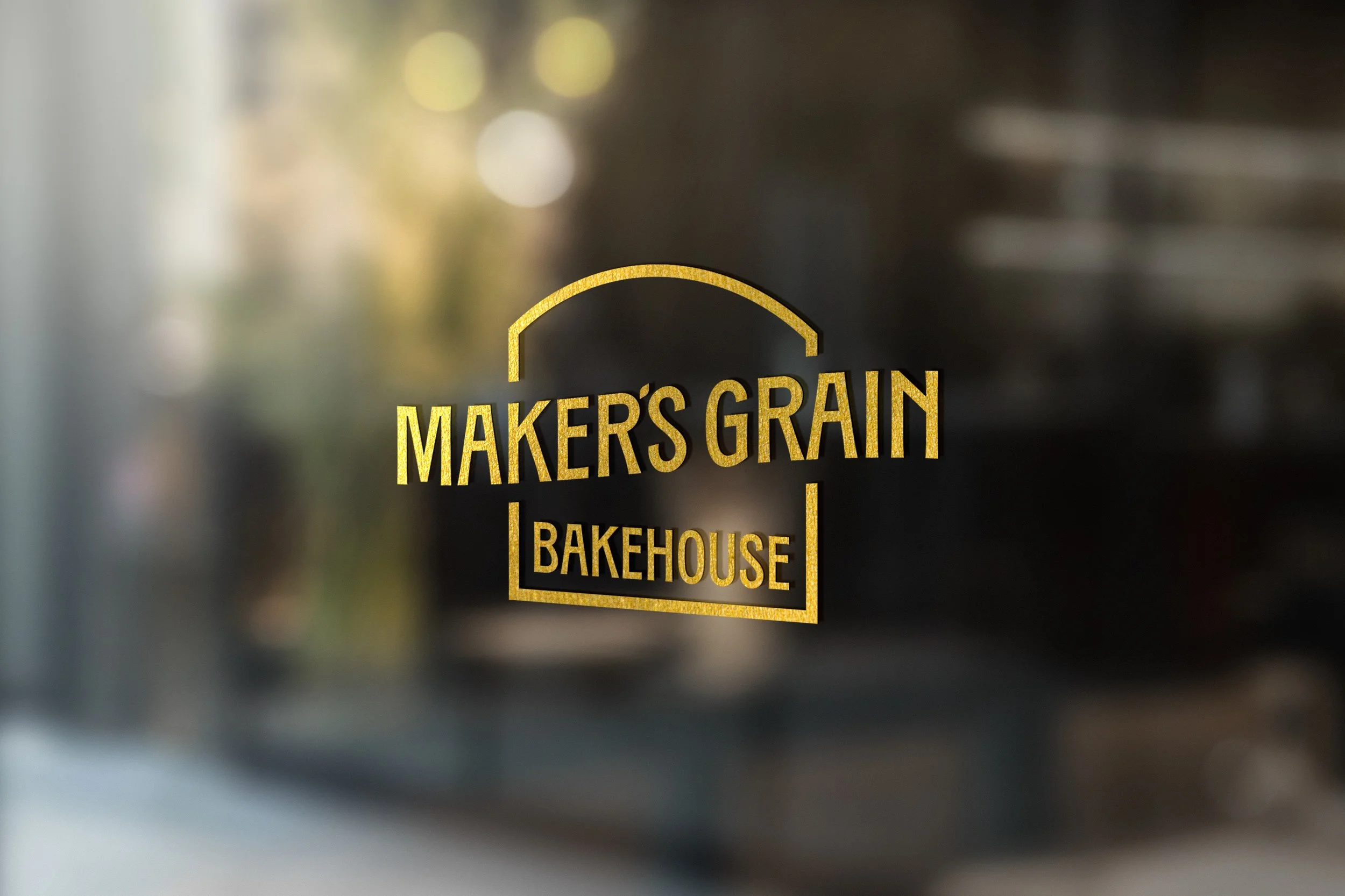
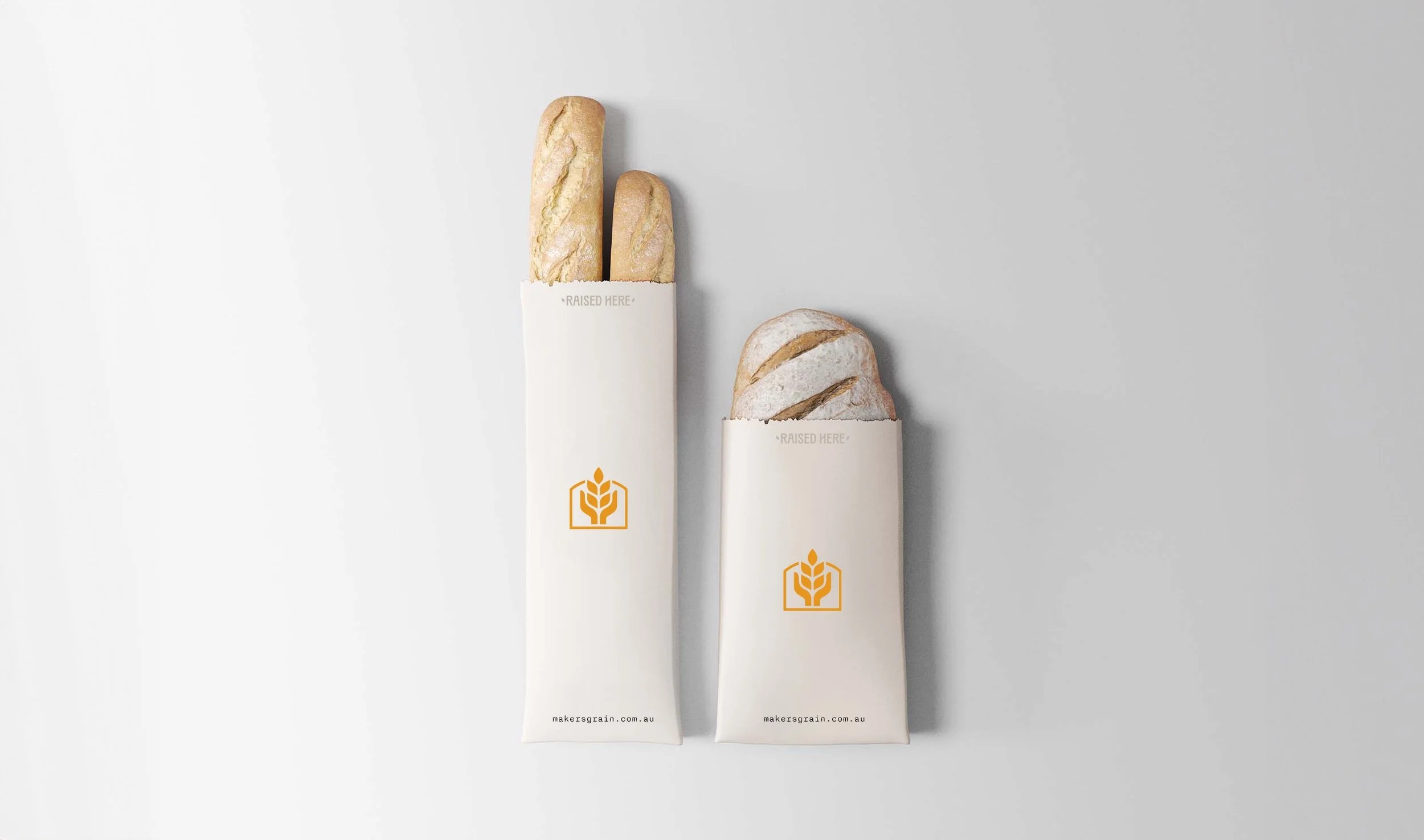
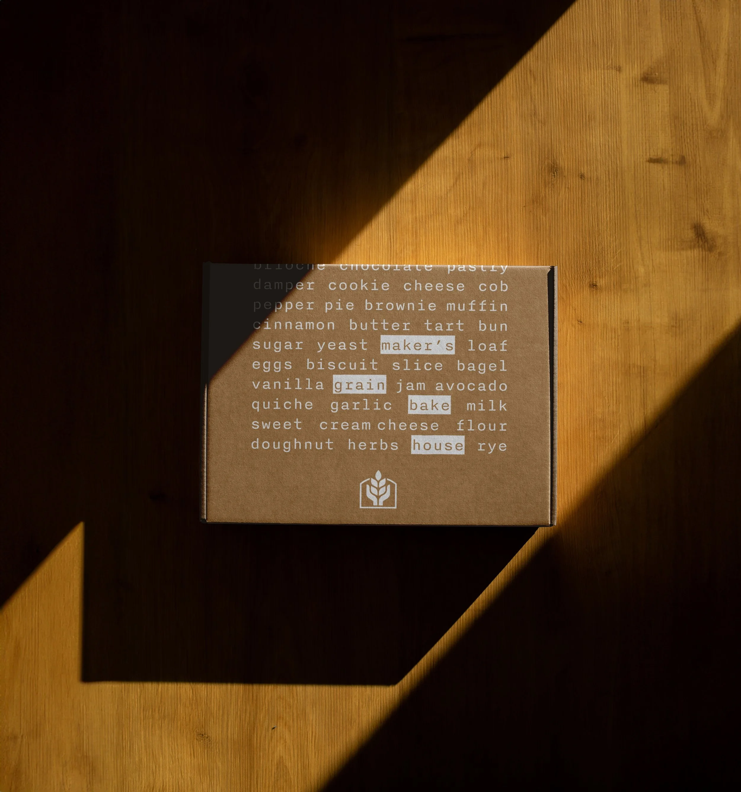
Maker’s Grain
New Brand Identity
Primary Role
Creative & Strategy Lead
Year
2024


Brief
Nestled in the heart of the New England region in a town rich of history, Tenterfield, had a new bakery being built. We needed to create a brand that reflect that heritage of the building and town.
Idea
The bakery was designed to mimic the shape of the iconic building it occupies, which notably resembles a loaf of bread. This architectural choice fosters a homely identity, combining a unique visual appeal that feels both fresh and familiar to customers.
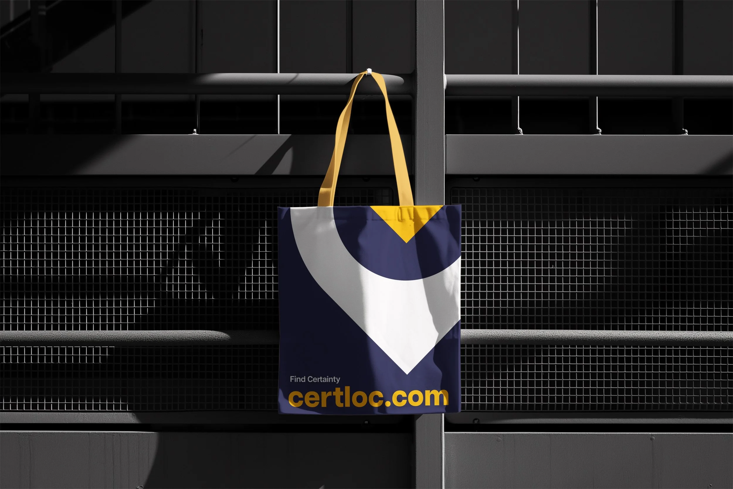
CERTLOC
Rebrand + Web Design
Primary Role
Creative Lead + Naming
Year
2024
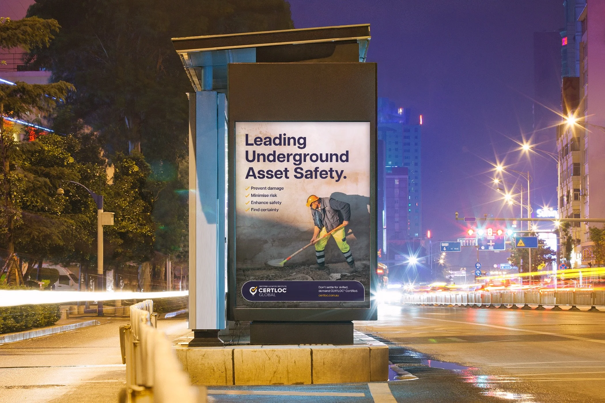
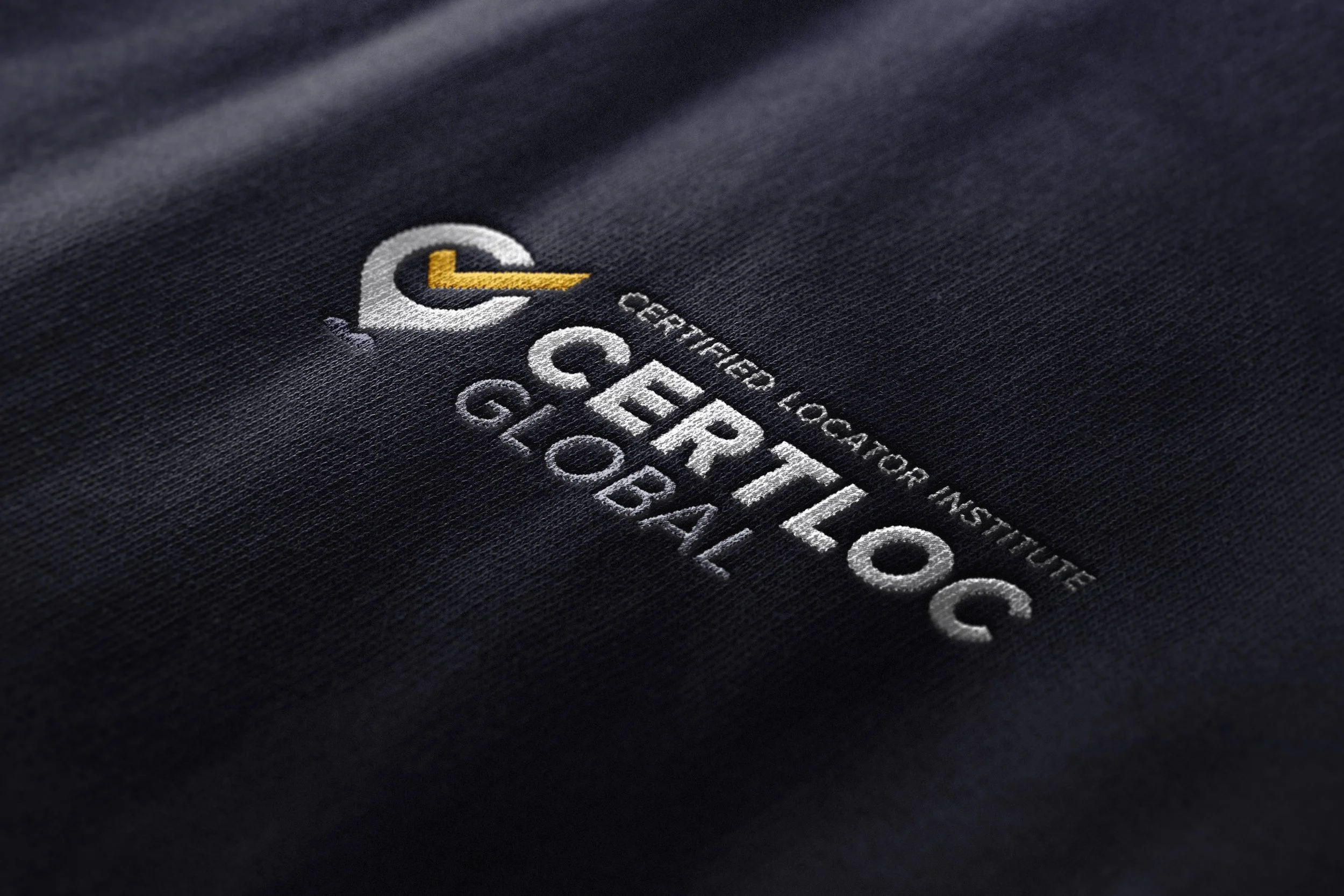

Brief
Transform a certification company into a global brand that redefines industry standards by challenging norms, driving innovation, and leading positive change focused on excellence and progress.
Idea
Being certain is the name of the game. Transitioning from their “Before you dig” roots, they now own the colour yellow in their competitive landscape, symbolising clarity and reliability. This bold shift ensures that their skilled Certified Locators find certainty, reinforcing trust and precision in their training and certification.
SGME
Rebrand + Collateral Rollout
Year
2024
Primary Role
Creative Lead
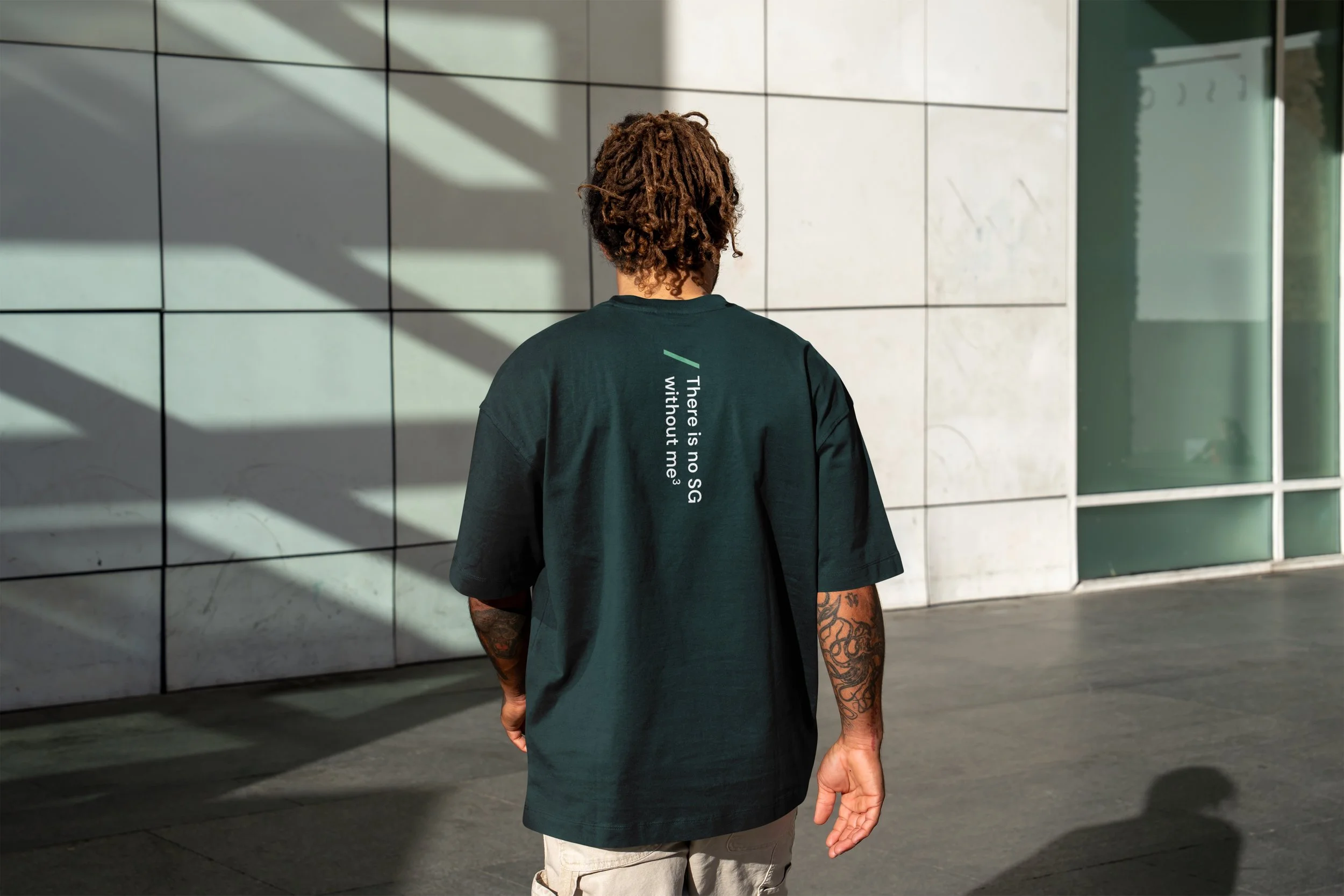
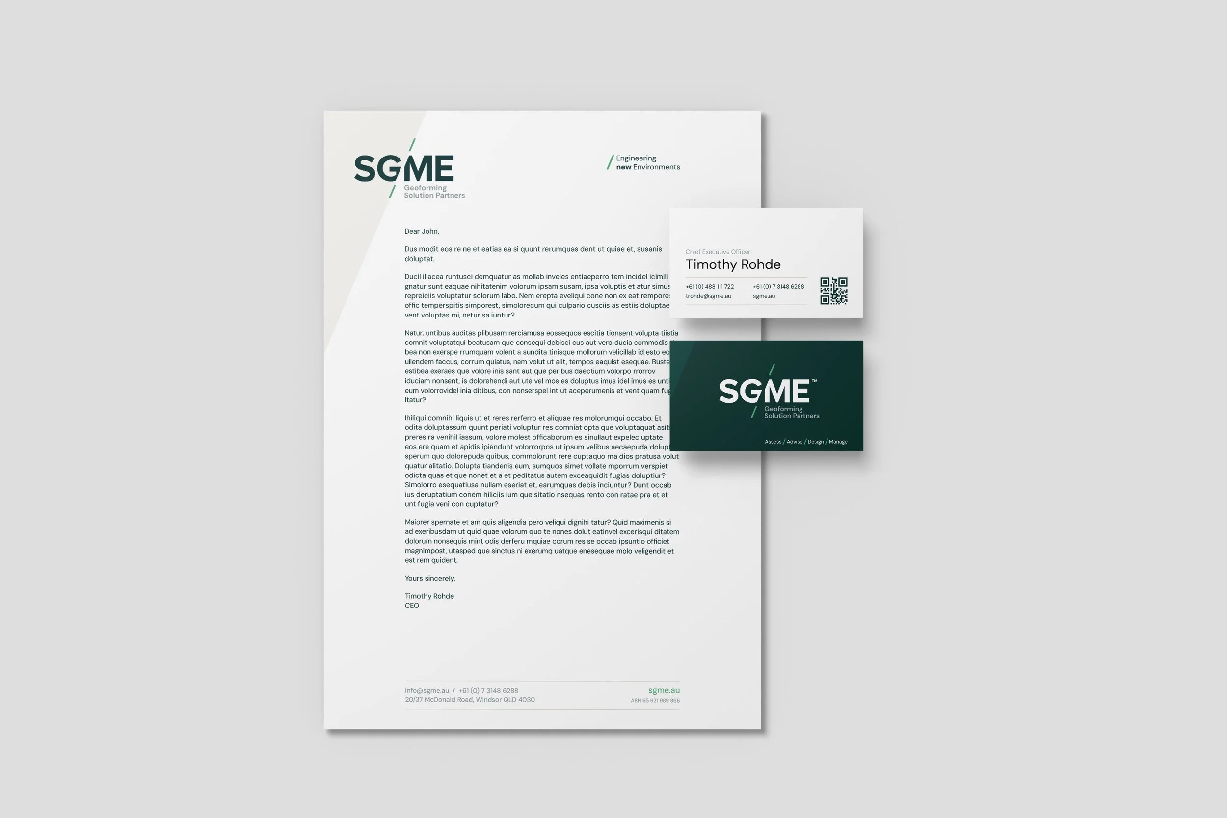
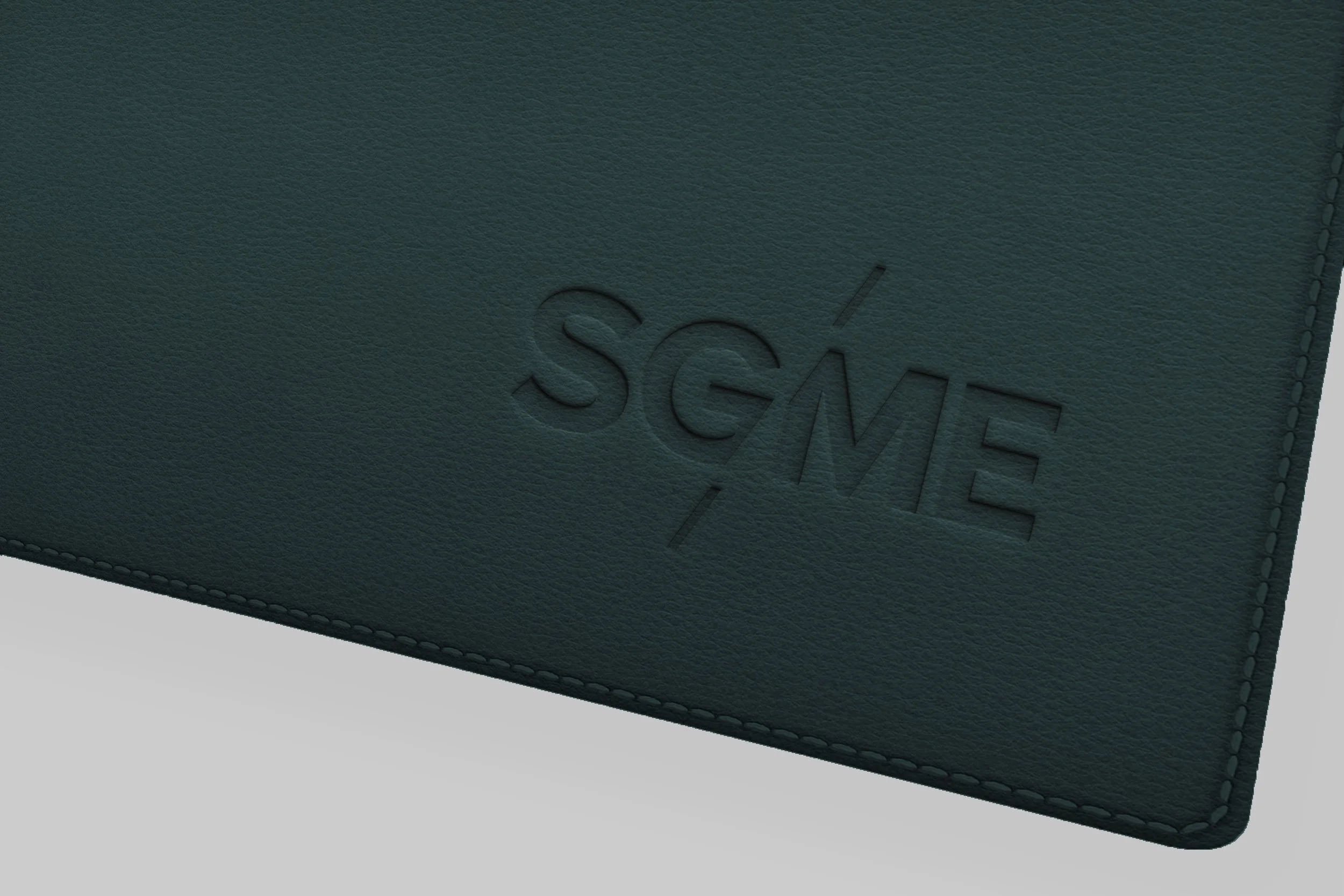
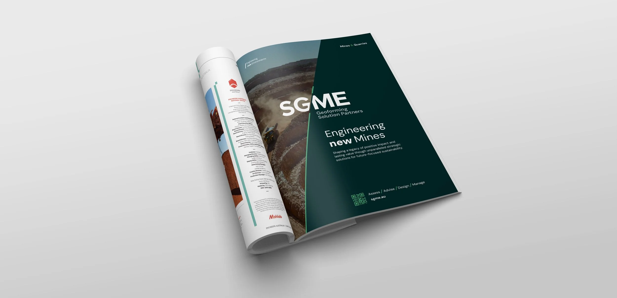
Brief
Modernise a husband-and-wife brand to rank among top Environmental Engineering leaders by refining identity, boosting digital presence, and applying innovative, sustainable marketing.
Idea
Using the Earth's 23-degree tilt as a guiding principle, the design incorporates this angle in every element; from the logo and visual language to the Ampersand featured in campaigns. Everything the company does is for the Earth.
Resource Realm
Client Christmas Gift
Primary Role
Creative & Strategy Lead
Year
2023
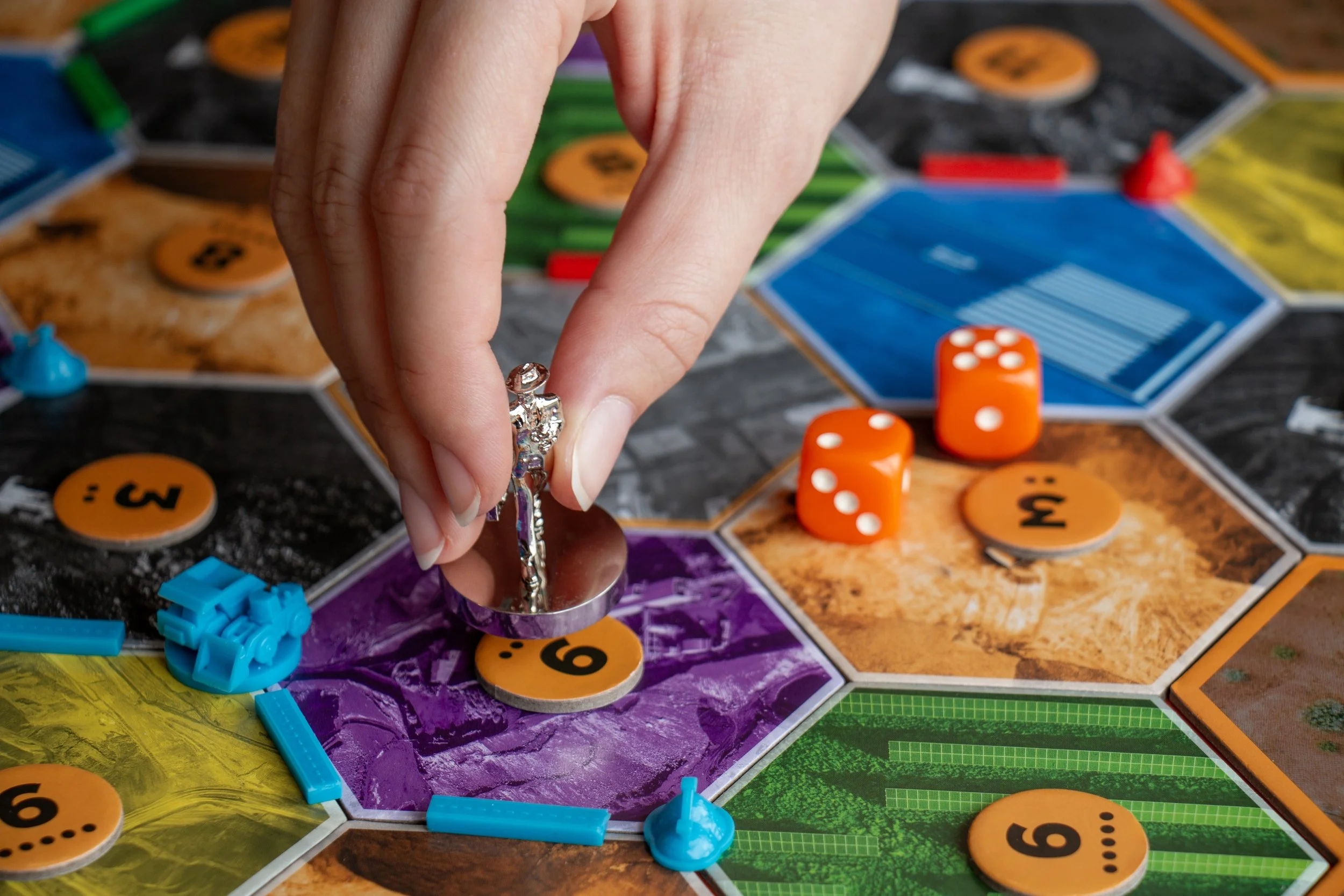
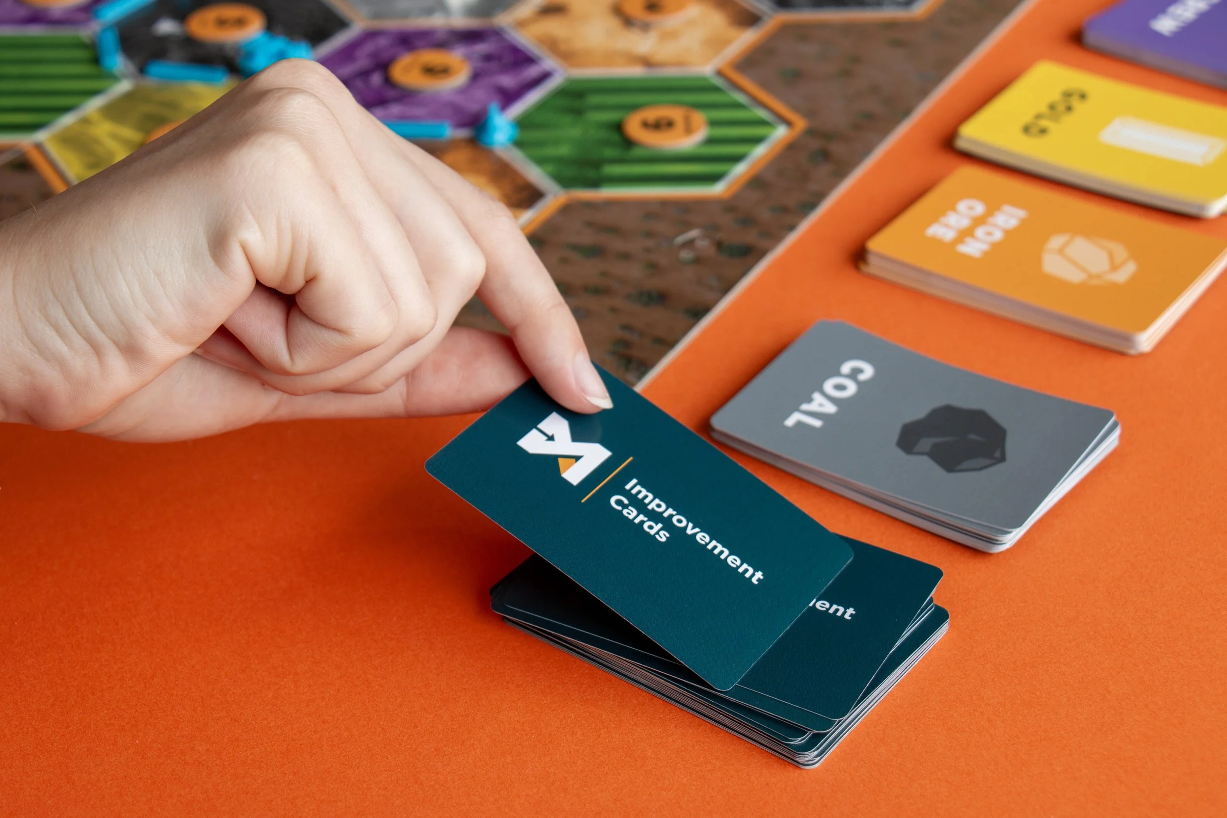
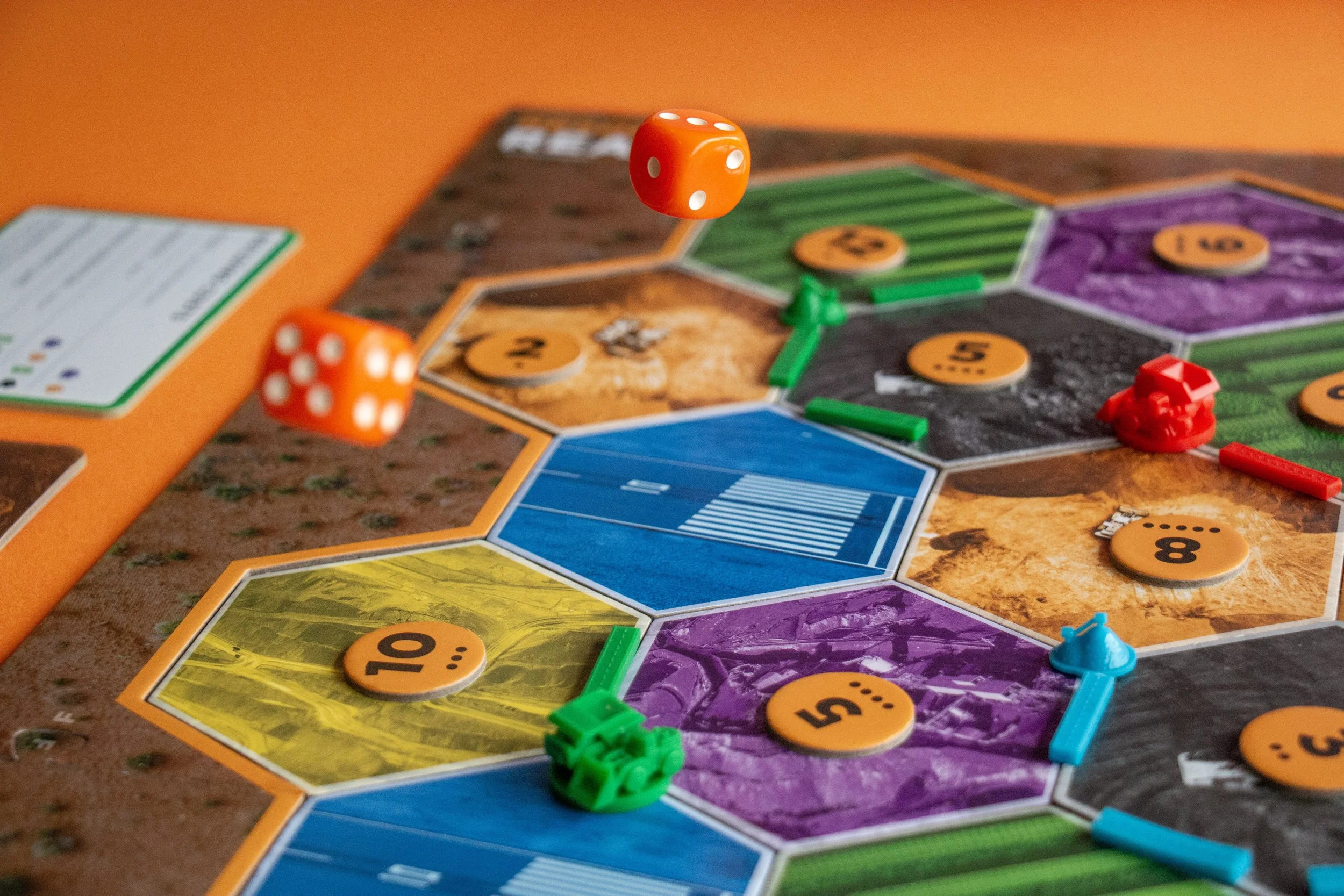
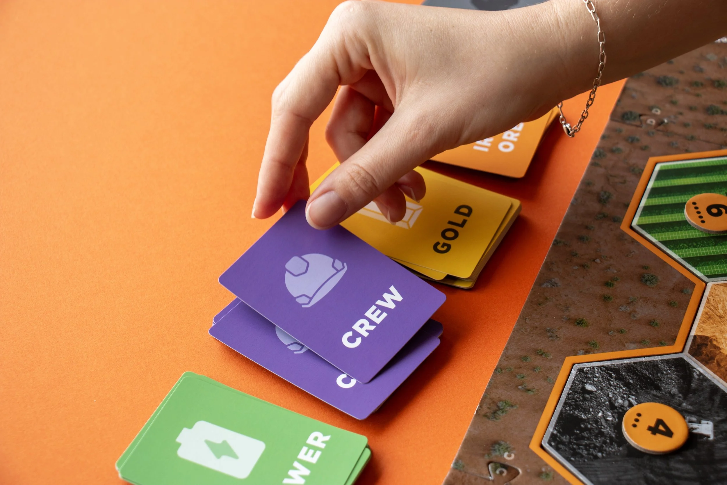
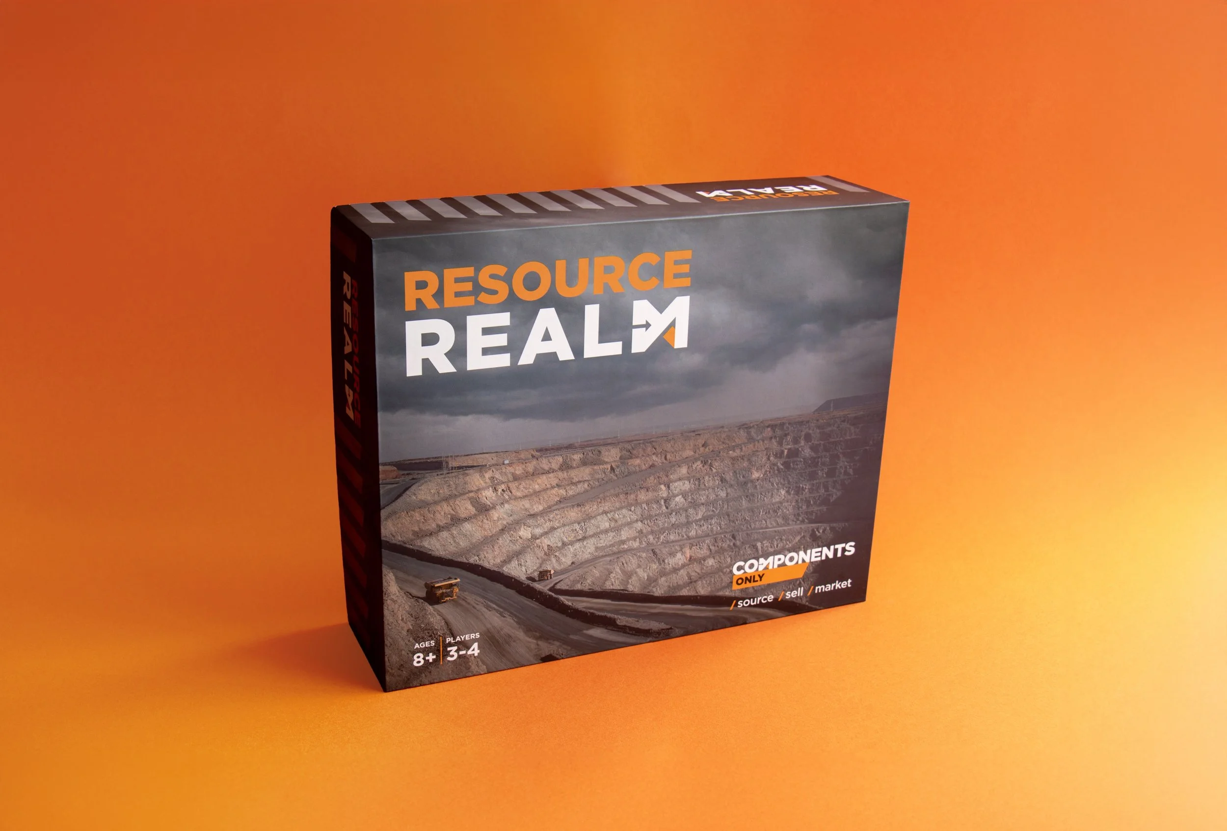
Brief
To develop a follow-up gift that resonates deeply with the client’s customers and can be enjoyed inclusively by their families throughout the Christmas season.
Idea
Inspired by a well-known resourcing game, Catan, we designed a custom branded board game designed to appeal to everyone - from key white collar decision makers to blue collar maintenance workers on-site - it reflects the brand’s commitment to quality and strategy. With 3D-printed pieces, gameplay rooted in real-world mining challenges and a clear path to victory if you work directly with the client.
Awards
National Print Awards - Finalist
Client Christmas Gift
Components Only Game
Primary Role
Creative & Strategy Lead
Year
2021
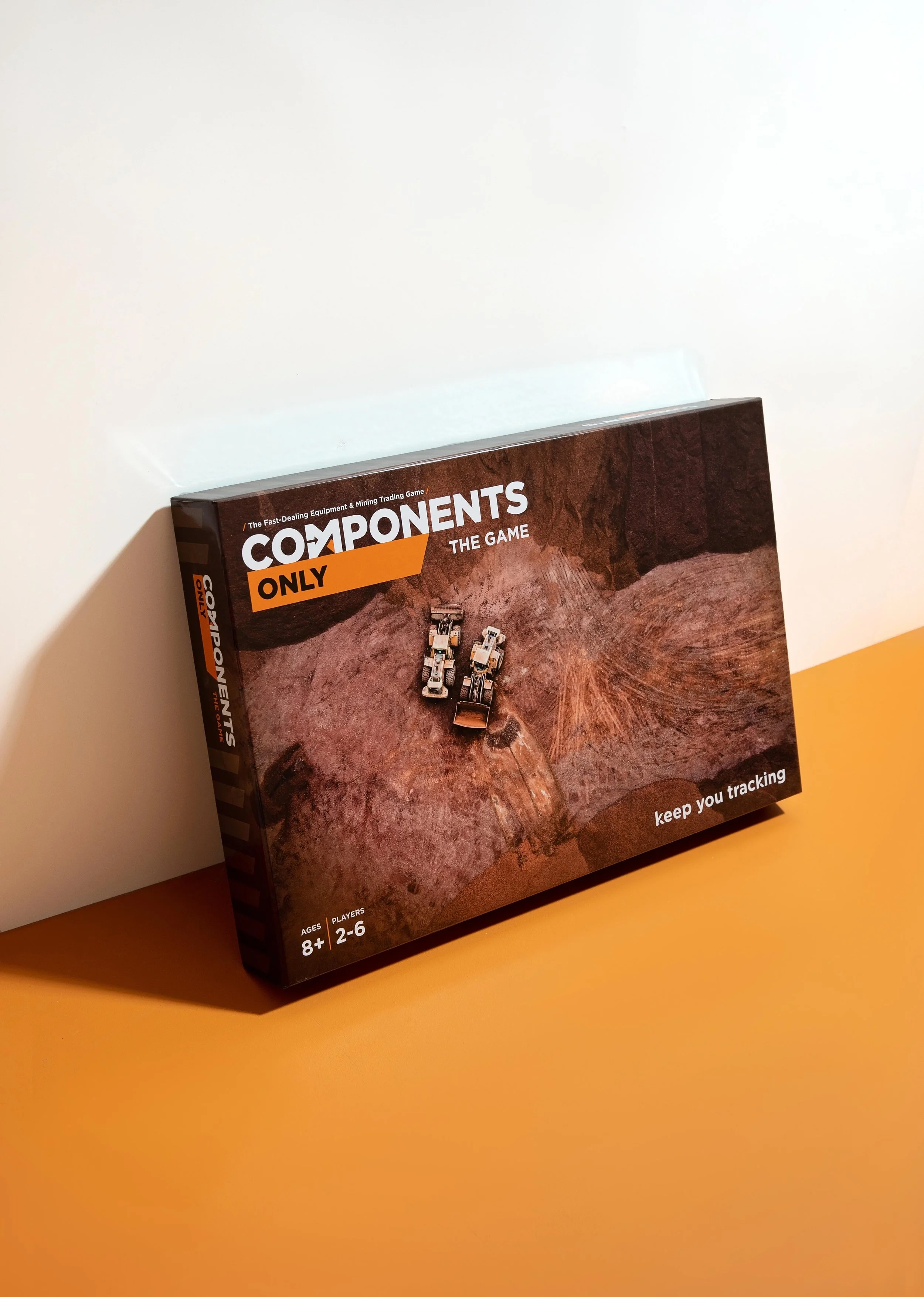


Brief
Create a fun and unique Christmas gift for the clients customers which can be practical, fun and inclusive of the whole family.
Idea
Inspired by the iconic board game Monopoly, we crafted a custom-branded version designed to be both familiar and highly accessible. The game board highlights locations serviced by Components Only, with each colored section organized to reflect groups of similar mines. The most affordable mines are coking coal and industrial coal, while the diamond and energy mines stand out as the most valuable and coveted assets.
Awards
BADC - Finalist
Collateral Rollout + Website
Buywood
Primary Role
Creative
Year
2021


Brief
Let the passion and meticulous attention to detail in the builds truly shine through in the roll-out.
Idea
An upscale, inspired brand delivering cohesive collateral, from brochureware to internal posters and signage; designed to ensure all spaces and materials authentically embody their brand promise: ‘Crafted to Experience.’
Brands I’ve worked on
-
![]()
Crimsafe
Proposal Rollout | Finished Art + Guidelines
-
![]()
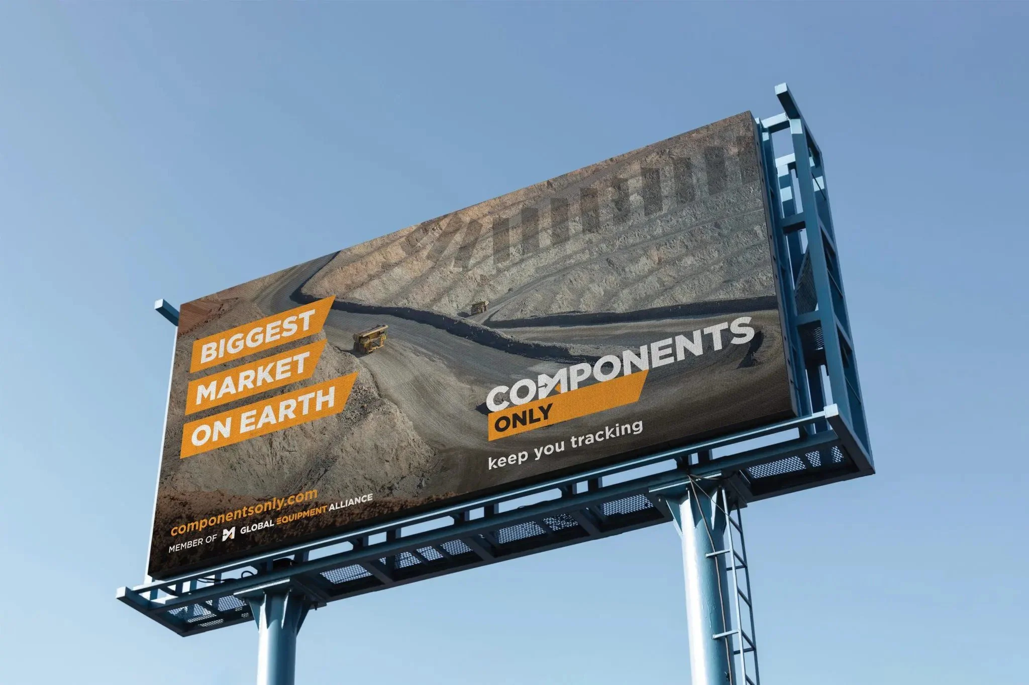
Components Only
Campaign Rollout | Internal Collateral
-
![]()
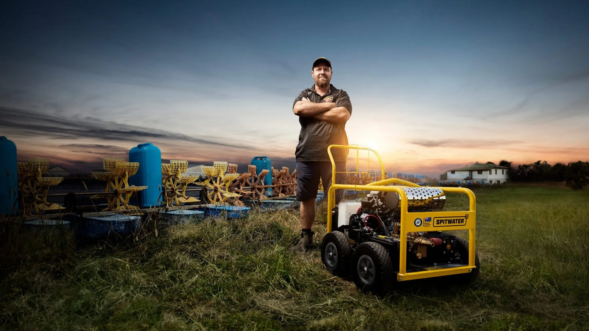
Spitwater
Campaign Rollout
-
![]()
TokyoTaco
Proposal + Creative Rollout
-
![]()
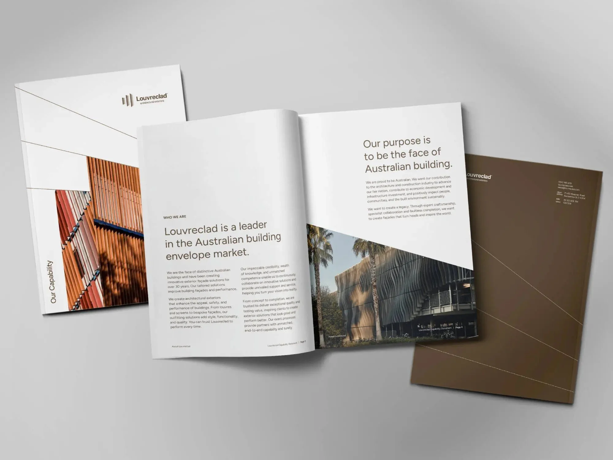
Louvreclad
Proposal Rollout
-
![]()
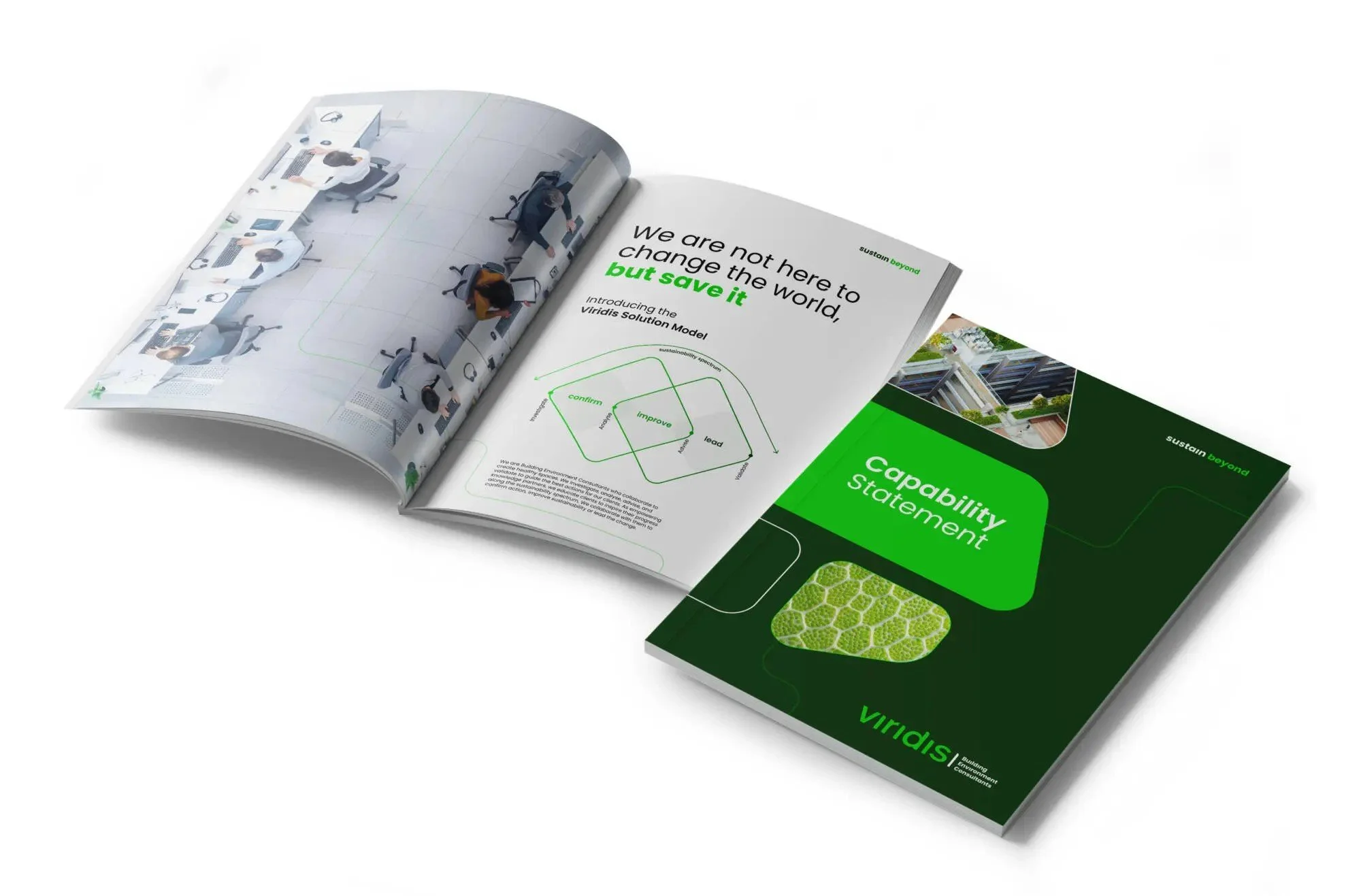
Viridis
Brand Design
-
![]()
Optima
Creative Rollout | Web Design
-
![]()
Oceania
Proposal + Creative Rollout
-
![]()
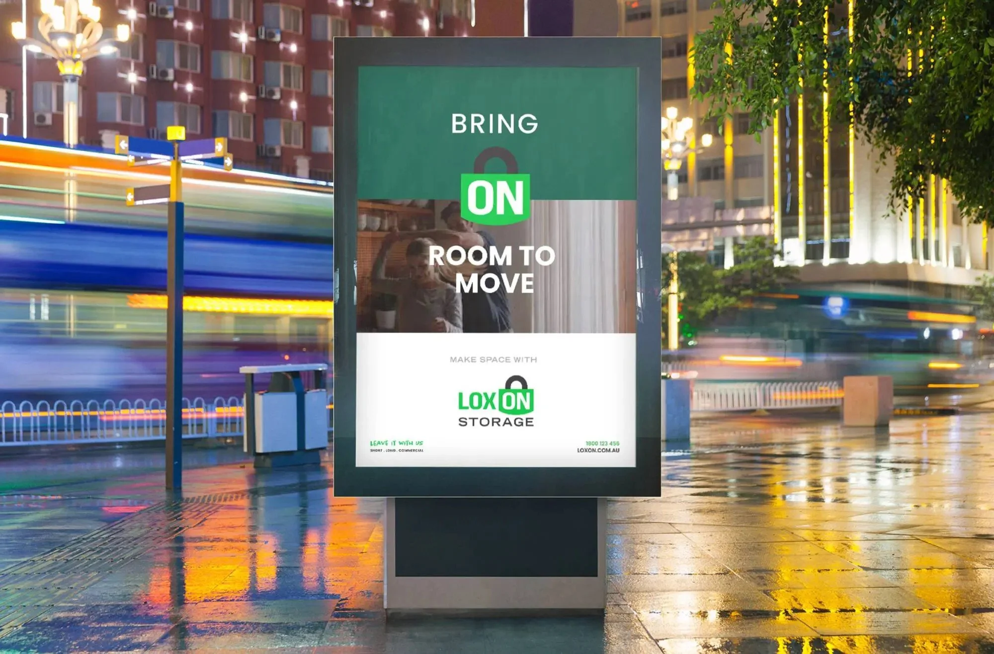
Loxon
Rollout
-
![]()
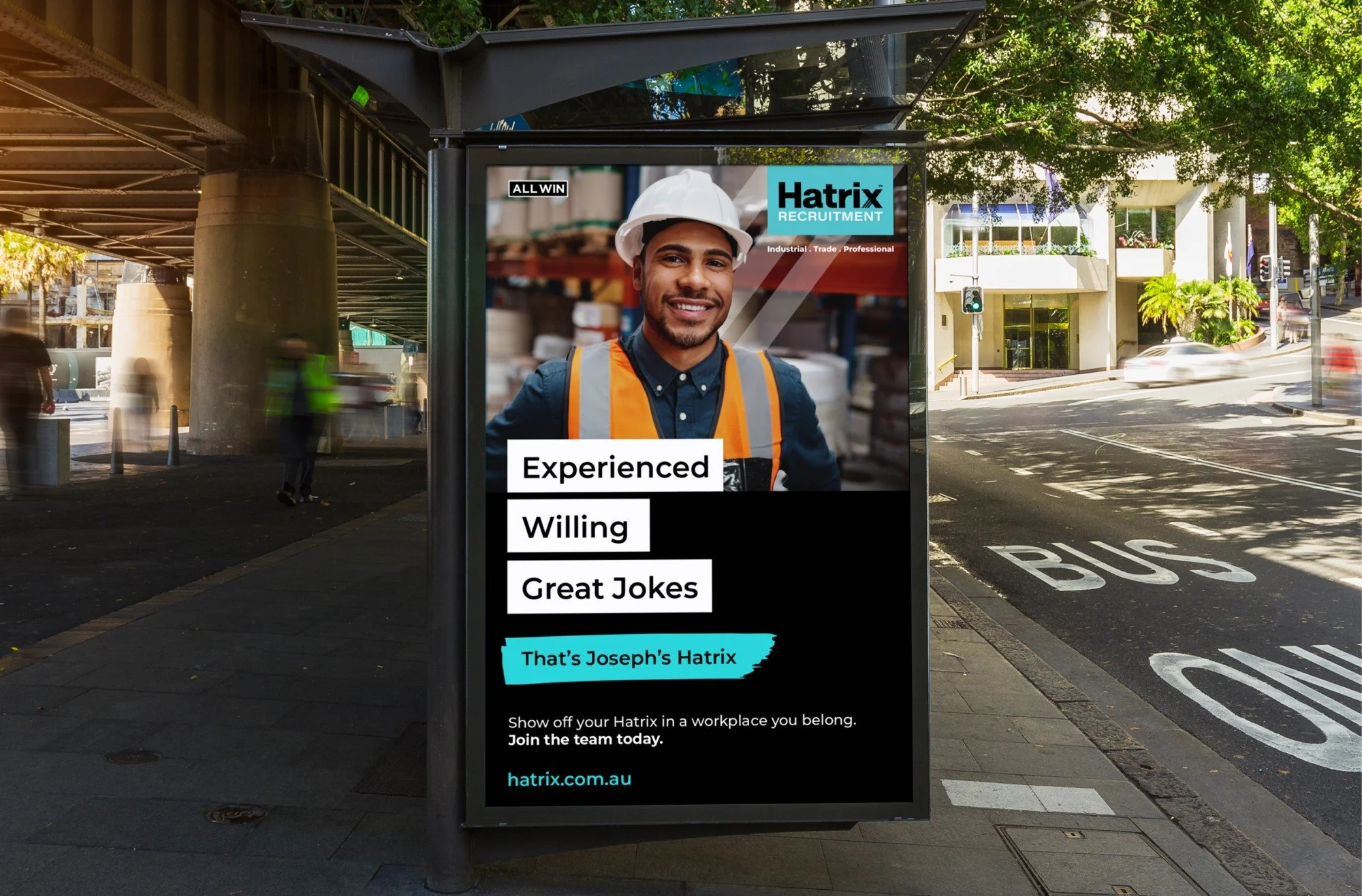
Hatrix Recruitment
Campaign + Collateral Rollout
-
![]()
Balance & Blend
Brand Design


Motion Graphics
Self taught and excited to get the opportunities to make anything move!
Figma
As most designers in 2025, I love Figma!
I have designed and prototyped many websites over the years, here are a few.
The Details
/ Experience
DAIS Brand Strategy Advisors
2019 - Present
Over five years at DAIS, I progressed from a junior to a senior designer in a fast-paced studio environment where adaptability was key. One day I might be brainstorming a brand new name that find the clients wants and needs, the next creating PowerPoint templates; and occasionally making a coffee or two. I led brand projects from strategy and naming through to visual identity and implementation, developing cohesive systems including logos, typography, colour palettes, and iconography, all grounded in strategic thinking. My work spanned both print and digital, including user-focused web and UI design from wireframes to developer handoff.
I worked autonomously across a wide variety of outputs, consistently applying a strong attention to detail whether building brand guidelines, crafting motion graphics for digital storytelling, or producing creative-led activations and campaign assets. No two days were the same. Alongside client-facing responsibilities, I also contributed to refining DAIS’s internal design systems and workflows, helping the studio grow and evolve over time.
Fuse Agency
2017
During my time at Fuse, I gained my first hands-on experience in a fast-paced agency environment. I worked across a range of design outputs including EDMs, social media content, and business cards for both client-facing and internal projects. Though my placement was short-term and part of my university studies, it offered valuable insight into agency workflows and client collaboration, helping lay the foundation for my career in brand and visual design.
Liveworm
2016 - 2017
As part of Griffith University’s Liveworm student-run studio, based at the South Bank campus, I completed multiple, intensive eight-week, 17‑hour-per-week elective that offered a first real taste of studio life. In that dynamic, drag-racer‑style environment I juggled multiple briefs—cutting my teeth on a diverse range of projects. One highlight was typesetting and laying out The Art of the Skins book for the State Library of Queensland, part of the 2016 exhibition, which gave me real-world publishing experience. Working alongside fellow students under tight deadlines taught me to adapt quickly, collaborate effectively, and meet professional standard
/ References
Jack Perlinski
CEO
Jack@dais.com.au
07 3216 0990
Natalie van der Rijt
Creative Director
Natalie@dais.com.au
07 3216 0990
/ Knowledge
Griffith University
2015 - 2017
Bachelor of Design
Major: Visual Communication
Minor: Sound Design
/ Weapons of Choice
After Effects
Premiere Pro
Blender (Basics)
Proficient Bonus
InDesign
Photoshop
Illustrator
Figma
The Unglamorous Ones
Word
PowerPoint
Google Suite
Canva
Hands-on with Mac, Windows & Linux
Computer Hardware Know-how
All things board games
Niche Tomes of Wisdom
3D Printing Experience
Basic Japanese